In 2025, social media isn’t just about getting likes—it’s about getting results. For marketers, that means turning scrolling thumbs into clicking fingers. But how do you design a post that actually drives someone to leave their feed and visit your website? It all starts with strategic visual and content design.
It Begins with the Hook: The Power of First Impressions
When someone is scrolling at lightning speed, you’ve got milliseconds to grab attention. That’s where your image or video thumbnail comes in. Use bold colors, high contrast, and emotion-triggering visuals that match your brand’s tone. Posts that feature expressive faces or surprising elements consistently outperform more generic graphics.
For example, adding motion or storytelling in the first few seconds of a video can increase click-throughs by over 30%, according to HubSpot. Visual hierarchy matters: make sure your most important message is the first thing the eye sees.
Design for Curiosity, Not Just Information
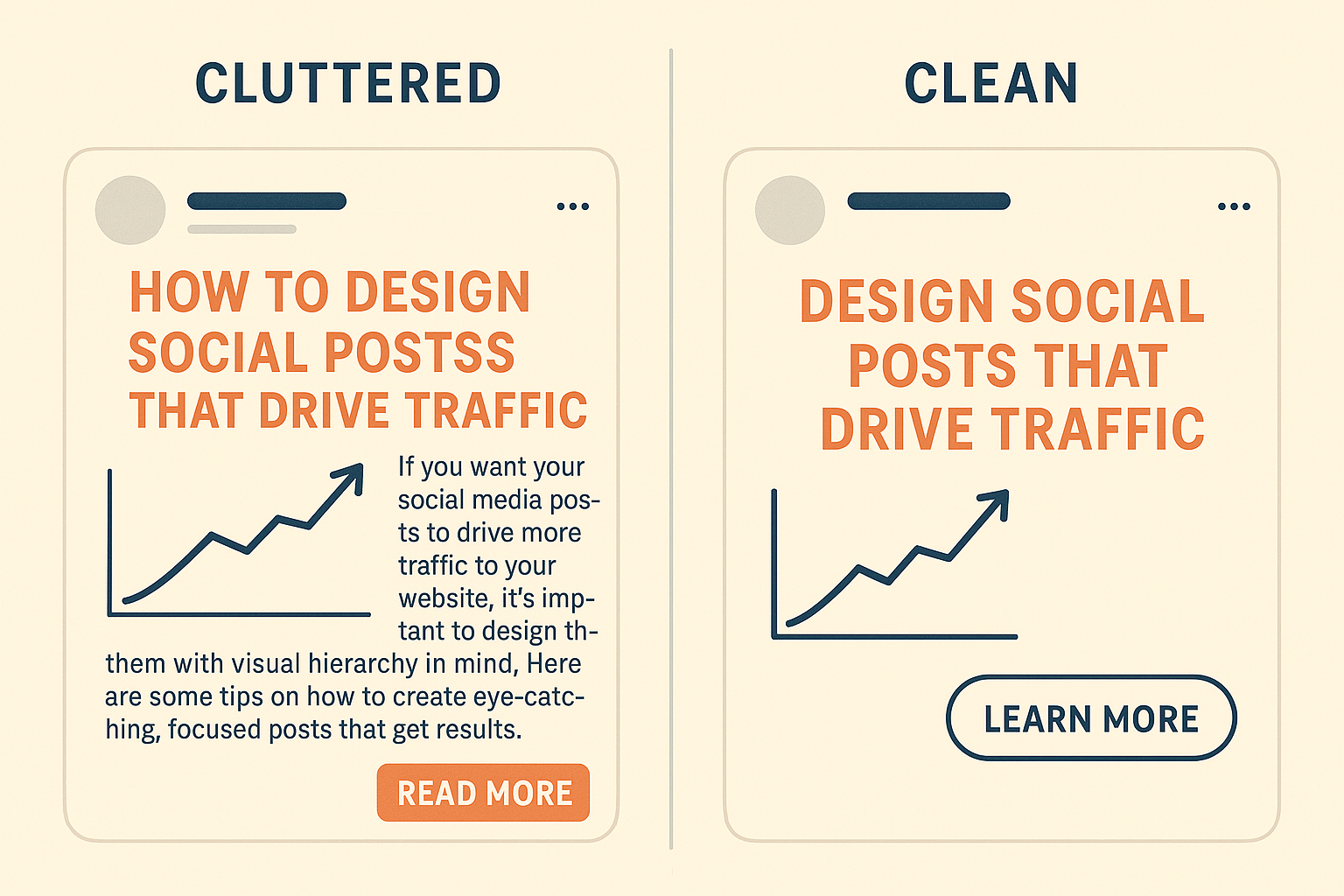
A lot of brands still overload their posts with text or try to explain everything up front. But curiosity is a powerful driver of engagement. Use your post to hint at the value of the content rather than summarize it. Questions, teasers, or partial headlines often perform better than full explanations.
Instead of writing: “Here Are 5 Tips to Grow Your Email List Faster,” try: “Struggling with slow email signups? These 5 tricks actually work (especially #3).”
Use Click-Worthy Copy and Clear CTAs Once you’ve stopped the scroll, your caption needs to finish the job. A well-written call-to-action (CTA) should feel like a natural next step—not a demand. Use phrases like:
- “See how it works 👉”
- “Find out why this strategy works in 2025”
- “Read the full story here”
Make sure your CTA is aligned with the visual content and appears early enough in longer captions so users don’t miss it.
Optimize for Mobile and Readability
Keep in mind that over 90% of social media is consumed on mobile devices. That means your text needs to be readable on small screens, your images shouldn’t be cluttered, and any link should lead to a mobile-optimized landing page.
Posts with legible fonts, clear spacing, and clean design layouts tend to perform best. According to Adobe’s UX research, users are more likely to engage with content that offers visual clarity and a clear path forward.
Track What Works—and Keep Refining
No design strategy is set-it-and-forget-it. Use platform analytics to track how different post formats perform. Pay attention to metrics like CTR (click-through rate), time spent on landing pages, and bounce rates. Use A/B testing to experiment with image styles, headline types, and CTA placements.
Final Thoughts
Designing posts that drive real traffic is part art, part science. You need compelling visuals, engaging copy, and smart UX principles—all working together. Social media isn’t just about being seen. It’s about inspiring action.